Introduction
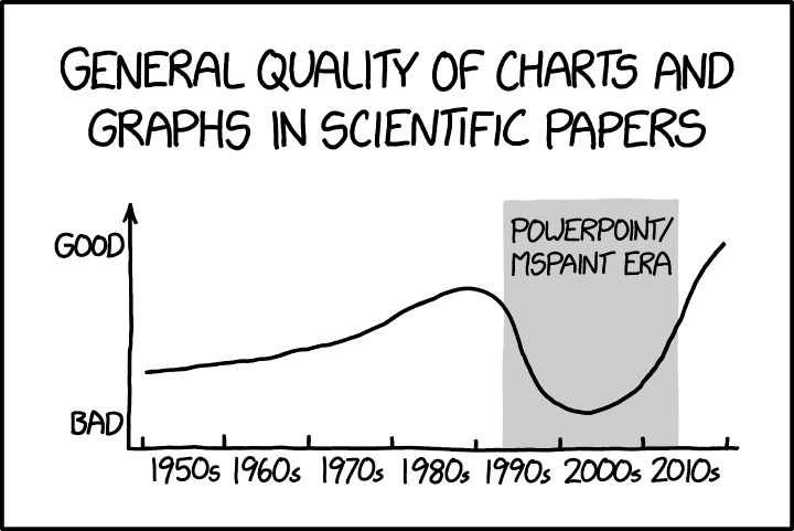
In 2013, the Matplotlib project officially added the 'xkcd' style sheet. This style adopts the look and feel of Randall Munroe's extraordinarily influential xkcd webcomic. Similar implementations for R, D3, Mathematica, and other software appeared around the same time. Whilst I doubt that the xkcd theme is going to cause the next Columbia disaster, I will attempt to make the case that the popularity of this style is not without hidden costs.
xkcd has a strong focus on scientific topics, which means that it is no stranger to the visual display of quantitative and semi-quantitative information. The irreducible characteristic of Munroe's charts in xkcd is that he eschews the use of a straight-edge in hand drawing them. This means that parallel lines are not, quantities are approximate, and the overall effect is a sort of 'back of the envelope calculation' æsthetic. Comics tend to be path-dependent: readers don't expect sudden changes in presentation. This is because comics generally articulate a personal artistic vision, conceptual continuity, and at least a semi-shared world. This is not to say that stylistic gear-shifts can't happen, however they usually signify some form of paracosmic discontinuity or communication side-channel from outside the established artistic universe. An example which springs to mind is 'Aaahh!!! Real Monsters', where scenes shown from Krumm's memories or imagination are drawn in a remarkably degraded style, acting as a cue as to the peculiar quality of Krumm's mental life. If Mr Munroe busted out MATLAB to crank out a plot—with confidence intervals and everything—we might reasonably suspect that the 'medium is the message'.
Hand-Drawnness and Pseudo-Hand-Drawnness
It is of course unfair to criticise xkcd on grounds of maintenance of stylistic continuity. It's also unfair to criticise hand-drawn charts in the narrow sense. Some of the all-time greats were drawn without the benefit of computers (and, as Tufte laments,1 may actually be better off for it). I learned how to draw with a T-square and compass, and respect the craft.
However, it is absolutely fair to criticise charting packages which aim to mimic the hand-drawn style of xkcd's charts. The features which make a chart 'hand-drawn' are those which divorce it from machinic precision. But drawing something imprecisely is not the same thing as ablating the already-existing precision from a drawing. The former is defensible expedience, the latter is philosophically fraught. If quantitative information is important enough to visualise at all, it is important enough not to artificially degrade for essentially stylistic reasons. Perhaps the intention is to articulate the orders of magnitude of the data, or the broad strokes of the data, or the functional form of the data, or the uncertainty or provisional status of the data, or to not intimidate viewers with terrifying mathematical precision. In that case, one can do worse than just showing the data in as high a resolution as possible and having faith in the intelligence of your audience, and we find that people often do.
Case Study 1: Thomas' FineWeb Distribution of Tokenised Lengths
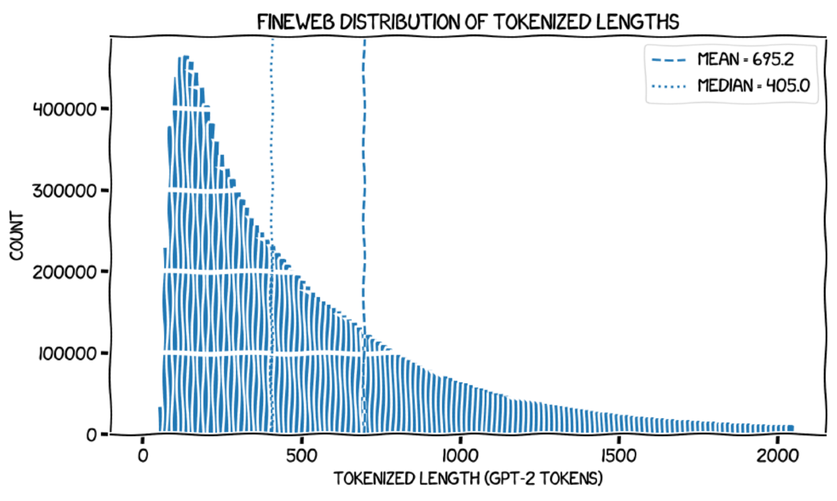
Here's an xkcd-style chart, from Giles Thomas' 'Writing an LLM from Scratch' series. I couldn't find an account of why he chose the xkcd style, however it's a reasonable inference (-sigh-) from reading Thomas' blog that he a) likes the look; and b) has committed to stylistic continuity across his considerable body of writing. In another post, Thomas notes bumping up against the limitations of the theme (in terms of the white borders placed around scatter plot markers, which have the general effect of obscuring highly overplotted data). In the present example, we find that the theme introduces significant artefacts, including moiré features, deformed fiducial cutouts, weird little triangular defects caused by deformation of the corners of the the histogram bars, and an apparent run of anomalously high values around a tokenised length of 1000.
Here, I reproduce Thomas' original plot because the scale of the features of the xkcd style is actually DPI-dependent: at high DPI the wobbles become tiny, the moiré disappears, but the triangular defects are enormously magnified.
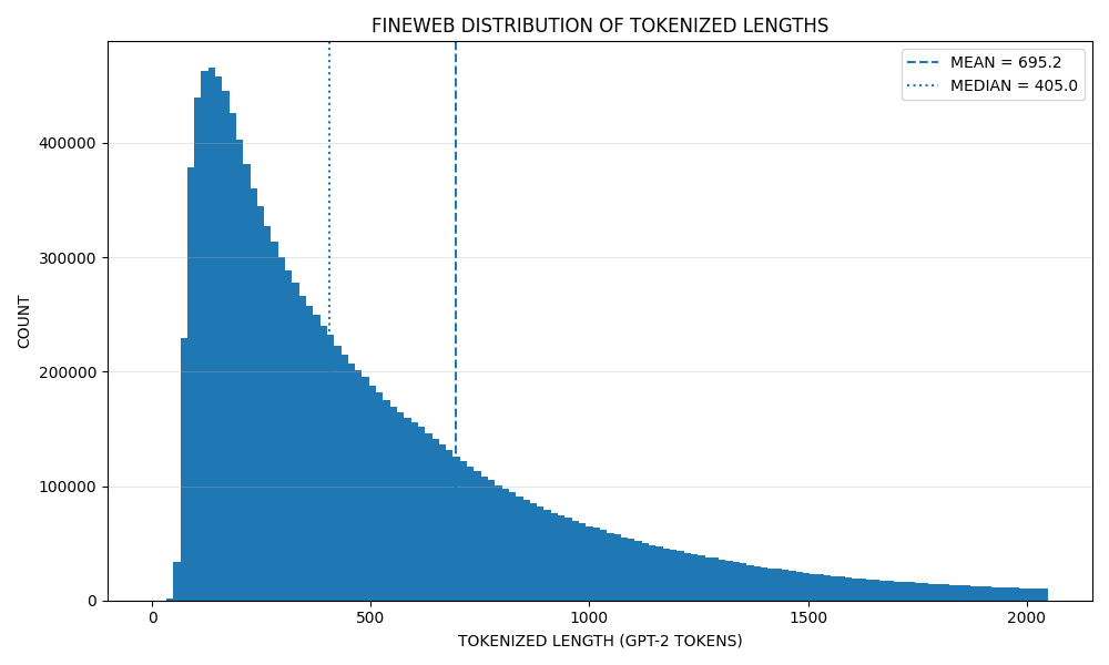
Thomas has documented his workflow in great detail, which means that it's not too much trouble to reconstitute the plot without the xkcd style. For the purposes of direct comparison I have simply turned off the xkcd theme and set the font to whatever my system default is (probably DejaVu Sans), without changing any other parameters (including DPI):
This confirms that the anomalous run around 1000 tokens is indeed purely an artefact of the theme. We also find that an apparent shoulder in the vicinity of 650 tokens—which could be written off as wobble—is actually real, and represents a deviation from the text length distribution which one (by which I mean 'I') might naïvely expect based on Zipfian arguments. If we assume that the GPT-2 tokeniser encodes approximately 0.75 words per token (a common rule of thumb), this deviation may correspond to an excess of texts which is pleasingly close to 500 words (488 words). This is suggestive of writers bumping up against a common word limit (e.g. a 500-word abstract or similar), or some sort of large-scale truncation of texts in the wild. The modal run token length is then also interesting: the center of the modal histogram bin is approximately 135 tokens, which neatly corresponds to 101 words by the foregoing heuristic.
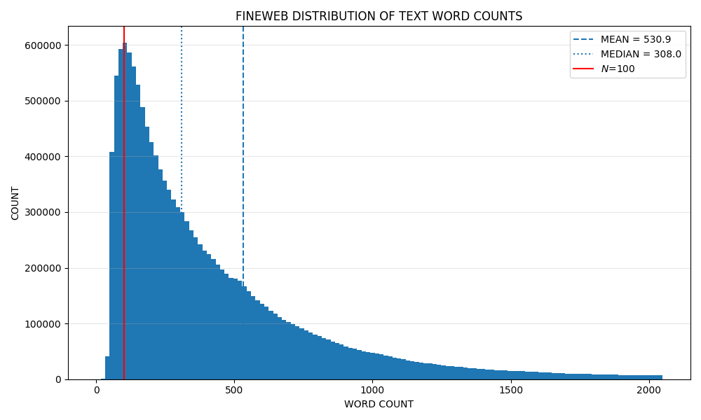
In fact, we can just plot the length distribution of the corpus in words. Here, I tokenise the corpus by non-word characters, and we obtain a distribution with a clear bias around 500 words. This is an elementary observation, but I for one would not have thought to investigate it had I not noticed the bump in the token length distribution, a bump which is virtually obliterated by the use of the xkcd theme.
I do not claim that these latter two figures are particularly good, merely that the xkcd theme is here worse than Matplotlib defaults in potentially consequential ways.
Case Study 2: Wikipedia's Receiver Operating Characteristic Figures
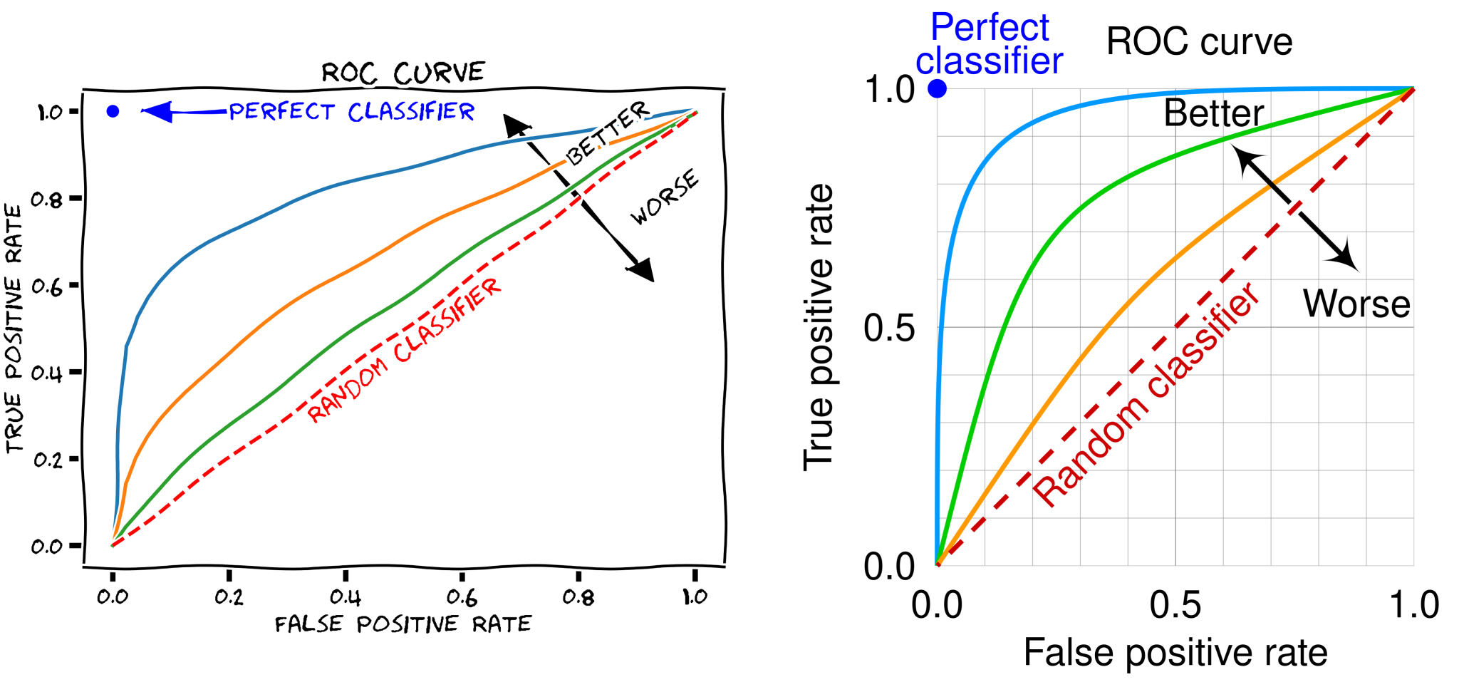
A Receiver Operating Characteristic (ROC) curve is a plot which measures the discriminating performance of a binary classifier. In short, it measures the true positive rate of a binary classifier as a function of the false positive rate. This is a function of the degree and shape of overlap of the probability distributions for the positive and negative signals of the observable. In 2018, the Wikipedia page for the ROC included a graphic plotted in the xkcd style, which has since been problematised in the talk page of that article and replaced with something more default. The problematisation is fairly generic: the image simply 'just doesn't seem appropriate for an encyclopedia'.
Importantly, the replacement image has a 1:1 aspect ratio and clearly demonstrates symmetry about the diagonal. This symmetry will obtain where the underlying probability distributions for the positive and negative conditions of some observable are themselves related by symmetry. The original plot lacks a 1:1 aspect ratio, and (in my opinion) it is difficult to determine if it is actually supposed to be symmetric, because of the perturbation of the plot by the xkcd style. This may make it difficult for readers to determine if the ROC can be symmetric or asymmetric in principle, leading readers to fail to consider the statistical circumstances giving rise to these possibilities. Neither of these charts are particularly great, however the latter is manifestly superior because it unambiguously demonstrates the in-principle symmetry of an ideal ROC curve. This immediately demystifies its functional form vis-à-vis the xkcd-styled figure.
Conclusion
In closing, xkcd chart themes are of questionable value. As we have seen, the Matplotlib xkcd theme lacks æsthetic generality, failing badly in common use cases such as high-density scatter plots and histograms. The theme creates significant quantities of Tuftean chartjunk as a matter of course, and imposes perturbations upon the data to be visualised which disguises the functional form of the data and may obscure fine details. This in turn imposes a potential cost on the viewer in terms of insights unreceived and connections unmade. Don't let style overwhelm substance and nuance.
-
E.R. Tufte; The Visual Display of Quantitative Information 2e; Graphics Press (2001) pp. 118–120 ↩

