Introduction
One of the most important pieces of data visualisation of the last few years in terms of virality and memetic impact is from a paper by Waytz and coworkers, entitled 'Ideological differences in the expanse of the moral circle'. The most famous name attached to this paper is Jonathan Haidt, who has made a career out of studying the correlation between differential moral intuitions and political ideology. It looks like this, and you might see it several times in one day:

The visualisation summarises one of several studies in the work, and indicates the distribution of circles of highest moral concern in 'conservative' and 'liberal' cohorts, with the innermost circle corresponding to concern for one's immediate family, and the outermost circle corresponding to concern for all existing things.
Beyond Concern and Disregard
These limiting cases are quite interesting in light of the fact that we can easily propose more exclusive circles of moral concern, such as concern only for oneself, or concern for nothing at all. We can also propose extending moral concern to things which don't actually exist, which—whilst peculiar—is nonetheless compatible with modal realist moral philosophy. It is also the case that the operationalisation of circles of moral concern as a collection of strict concentric subsets may not adequately capture how people actually think about moral concern. As an example, circle 6 is 'all people you have ever met', but circle 7 is 'all people in your country'. It is not clear that someone who considers the wellbeing of all people within their country a personal moral concern necessarily feels this way about everyone they have ever met, a category which commonly transcends national borders and nativist sentiments.
Regardless of the construct validity of the study (which seems acceptable), these charts represent something quite unfortunate from a data visualisation and collection perspective. Both figures are in the form of heatmaps, expressing a two-dimensional kernel density estimation (KDE) of responses. In this context, the heatmaps can be loosely thought of as an estimation of what the histogram of the response data would look like in the limit of infinite responses and bin widths of 1 pixel.
Based on the raw data for these plots—which was provided by the authors—it is clear that what is being visualised is a KDE of mouse clicks or screen taps on the underlying 'bullseye' graphic. In this exercise, participants were asked to indicate the limit of their circles of moral concern by clicking on the bullseye graphic seen in the manuscript. Each sub-figure has an axis of heatmap density running along an approximate diagonal from the center, in line with the numerical labels indicating what each circle corresponds to. As such, these numerical labels served respondents as landmarks for where to tap.
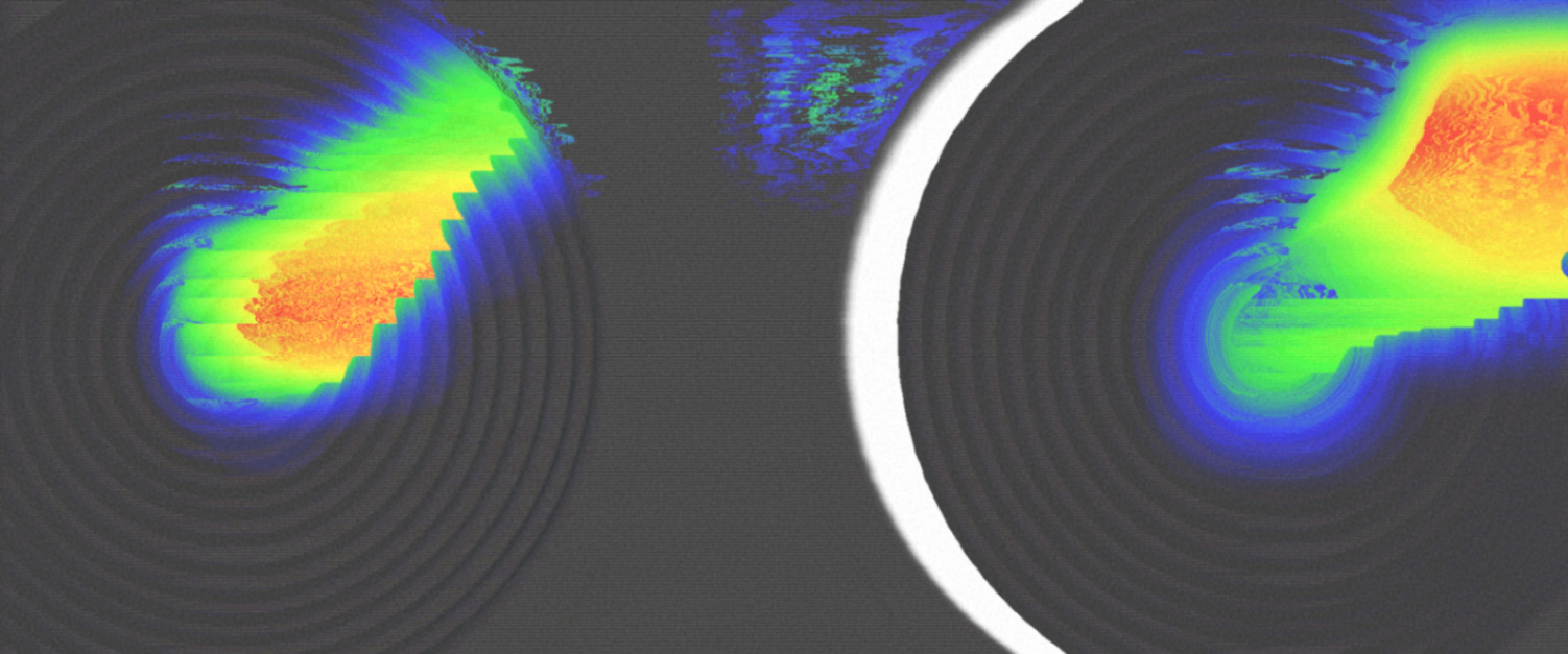
The Tuftean Objection
There are some things to note here.
- Operationalisation of moral concern is one-dimensional and integer valued. The bullseye graphic is 2D, as is the collected data. It possesses two degrees of freedom: a radial coördinate and an angular coördinate. Only the radial coördinate actually maps onto what the authors sought to measure.
- The rings are of different areas. If a participant is trying to hit a particular digit on the scale, not all rings are equal in terms of how easy they are to designate with 'fat fingers'. It would be an interesting programming challenge to determine by ray casting how much straight-line deviation from each digit is permitted whilst remaining in each ring.
- The rings aren't all the same width. For instance, ring 15 is noticeably wider than ring 16.
- The rings are not fully concentric, breaking the symmetry of the bullseye.
I've overlaid some lines to show what I mean.

These are not devastating flaws but do speak to a potential lack of attention in the creation of the instrument.
- A large area of each chart (about 41%) is simply out of bounds. It's unclear what it means to tap outside of any of the rings (however it also looks like no participant actually did). Perhaps this was rejected as invalid input.
- The colour maps used in the figure are perceptually non-uniform, and the opacity of the colour as a function of density is unknown. This, in combination with the wide bandwidth of the KDE, obscures the actual distribution of the data and its multimodality. This is to say that KDEs common in heat plots have a tendency to blur out the data.
Unweaving the Rainbow
Because the raw data is available, we can clarify certain aspects of these figures by eliminating the angular degree of freedom and only looking at distance from the centre of the plot. We can also eschew the heatmap presentation and instead look at histograms of the data, or 1D KDEs of our choosing. Finally, we can overlay the data for the 'Conservative' and 'Liberal' conditions to more directly inspect the differences.
This analysis is complicated by the fact that the raw data consists of screen coördinates for a screen of unknown dimensions, so it is not absolutely certain what the coördinates of the different rings are. However, after screwing around for a few minutes, what looks like a reasonable transform is obtained:

I am making a (defeasible) assumption that the lower limit of the data is from participants who have clicked right in the middle of the bullseye. What matters it that after transforms, the hypotenuse of these data lies more or less on the interval [0, 1]. This means we can scale a figure to roughly the radial extent of the actual responses, with 0.0 being approximately least concern, and 1.0 being most. With these caveats in mind, what we get when using a Seaborn KDE of bandwidth 0.25 is the following:

The trimodality seen in both the 'Conservative' and 'Liberal' conditions is striking, and not readily apparent from the heatmap figure given in the manuscript. Moreover, the extent to which both conservatives and liberals chose small or large circles of moral concern is something missing in all discussion of the heatmap figure that I have seen. This plot appears to be substantially more informative than the heatmap visualisation.
Analysis Code
Analysis code available here: https://github.com/litmus-ritten/waytz-analysis